Let’s face it… I suck at CSS… You know it. I know it. My dog knows it. However with the magic that is StackOverFlow I just did some useful CSS that I wanted to share.
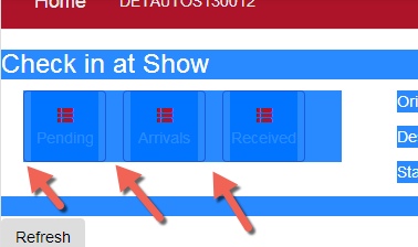
In an app I wanted to have 3 buttons in a row. Since this is an iPad app I wanted to make the buttons myself so the tab zone is bigger. I wanted to put some space in between the buttons so I first had:
margin-right: 15px;
This got annoying because the last button didn’t need to have that margin. It was causing an issue.
So then I did:
margin:left: 15px;
That got rid of the last wasted space but now I had it on the left of the first button.
So off to StackOverFlow I go and found this post. The accepted answer uses spans in the html and I didn’t really want that but there was a comment that had this:
span + span {
    margin-left: 10px;
}
so I used my classes and it worked great.
Declan also mentioned that something like:
.class ~ .class {
    margin-left: 10px;
}
Will only apply that to the FIRST element.
anyway here’s a picture.. you might notice the lack of a left margin on the first button.
Below is the code I’m using if interested.
.buttonMedium {
display: inline-block;
background-color: #fff;
border: #AC162C;
width: 75px;
height: 65px;
padding: 6px;
text-align: center;
white-space: nowrap;
cursor: pointer;
background-image: none;
border: 1px solid #AC162C;
border-radius: 4px;
color: #AC162C;
}
.buttonMedium + .buttonMedium {
margin-left: 15px;
}
